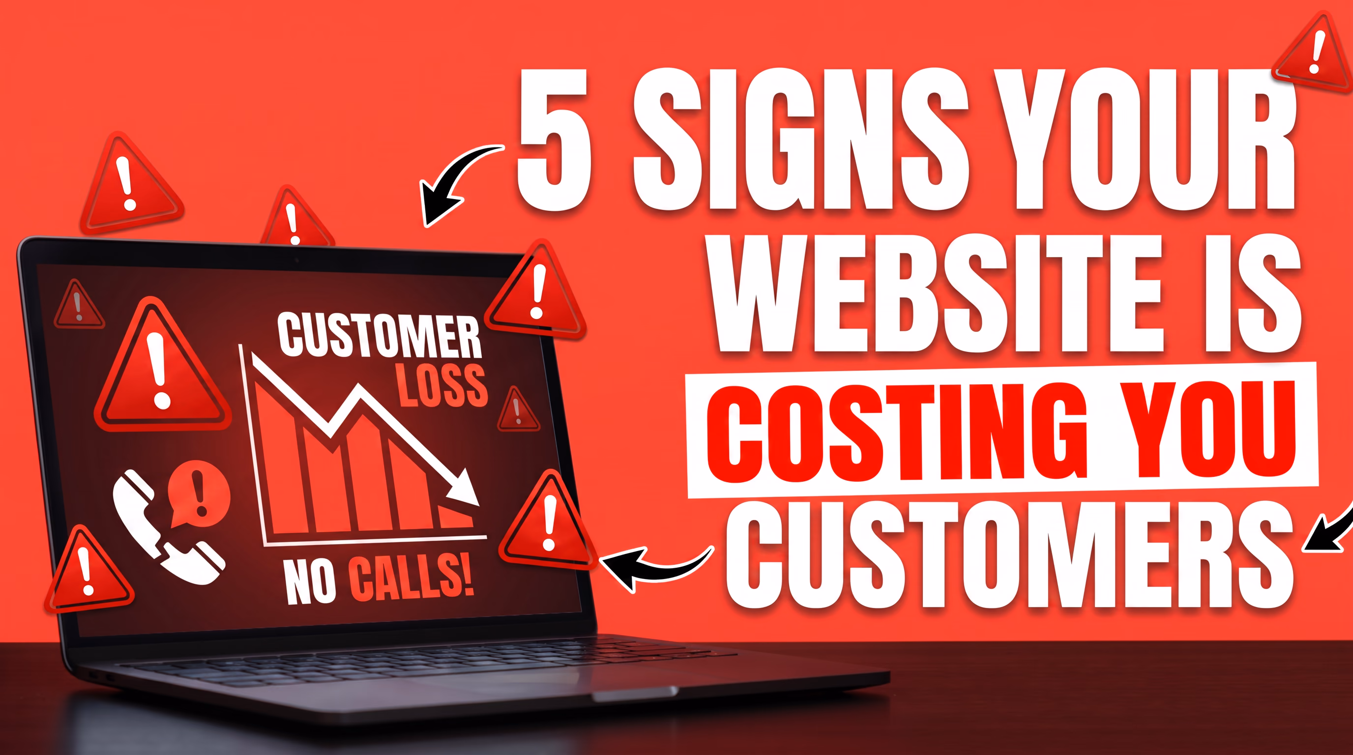
Why Your Business Website Needs More Than Just Good Looks
Your website looks great.
Your mates reckon it's sick.
Your mum shared it on Facebook.
But here's the thing...
It's not making you any money.
And that's a problem. A big one.
Because a website that looks good but doesn't convert is not an asset. It's a liability. It's costing you money every single day it sits there looking pretty and doing absolutely nothing.
I see it all the time. Business owners come to us at Dab Hand Marketing and proudly show off their site. The lovely colours. The fancy animations. The stock photos of people shaking hands in boardrooms.
Then I ask one question: "How many leads did it generate last month?"
Silence.
Your website is not a digital brochure. It's not a piece of art. It's a business tool. And if it's not generating enquiries, building trust, and converting visitors into paying customers, then it's failing at its one job.
In this post, I'm going to break down exactly what separates a website that works from one that just sits there collecting digital dust.
Fair warning — if you built your site on a cheap template builder, you might not love everything I have to say.

Speed Is Not a Nice-to-Have. It Is Everything.
Let's start with the thing most business owners completely overlook.
Speed.
Your website needs to load fast. Not "pretty fast." Not "fast enough."
Blazingly fast.
We're talking under two seconds. Ideally under one.
Google has been crystal clear — site speed is a ranking factor. If your site takes four or five seconds to load, you're being penalised in search results before anyone even sees your beautiful homepage.
But it goes deeper than SEO.
The Numbers Don't Lie
53% of mobile visitors abandon a site that takes longer than three seconds to load.
Let that sink in.
More than half your potential customers are gone before they've even seen what you offer.
Every second of delay reduces conversions by roughly 7%. If your site generates $100,000 a year, a one-second delay is costing you $7,000 annually.
A three-second delay? That's over $20,000 walking out the door.
And yet, most business websites built on template platforms are woefully slow. Bloated with unnecessary code, oversized images, third-party scripts, and layers upon layers of plugins that slow everything to a crawl.
Your hosting provider throws your site on a shared server with thousands of other sites, and suddenly your "beautiful" website loads like it's running on dial-up.

Why Template Builders Are the Problem
Here's where I'm going to ruffle some feathers.
If you built your website using one of those popular drag-and-drop builders — or you're running on a bloated content management system with fifteen plugins just to make your contact form work — your site is almost certainly slower than it needs to be.
These platforms generate enormous amounts of unnecessary code. For every element you see on the page, there are hundreds of lines of bloated markup happening behind the scenes.
It's like strapping a jet engine to a shopping trolley. Doesn't matter how powerful the engine is — the trolley was never built to fly.
At Dab Hand Marketing, we build websites from the ground up using modern frameworks engineered for performance. Sites that score in the high nineties on Google's own performance tests.
Not because we've found some magic trick. But because we don't saddle our clients with bloated platforms that were designed for beginners, not businesses.
Mobile-First Is Not a Buzzword. It Is a Mandate.
Here's a stat that should make you pull out your phone right now and look at your own website.
Over 60% of all web traffic comes from mobile devices.
In some industries, it's closer to 80%.
If your website is not designed mobile-first, you are ignoring the majority of your potential customers.
And no, I don't mean "responsive."
Responsive is the bare minimum. It means your desktop site squishes down to fit a smaller screen.
Mobile-first means you design the experience for mobile users from the very beginning and then expand it for desktop. There is a massive difference.

What Mobile-First Actually Looks Like
A truly mobile-first website considers how people actually use their phones. Thumbs, not mouse cursors. Small screens, not widescreen monitors. Spotty connections, not fibre broadband.
This means:
- Navigation that's easy to use with one thumb
- Buttons and tap targets large enough to actually hit
- Content that gets to the point immediately
- Forms that are short, simple, and don't make people want to throw their phone
- Images optimised for mobile connections
- Font sizes that are actually readable without zooming in
When someone visits your site on their phone and has to pinch and zoom to read your text, or when your menu is impossible to navigate, or when your contact form has fifteen fields...
They're gone. Visiting your competitor.
And they're probably not coming back.
User Experience Is Your Silent Salesperson
User experience (UX) is one of those terms that gets thrown around a lot but rarely understood properly.
It's not just about how your site looks.
It's about how it feels to use.
It's about whether a visitor can land on your site and immediately understand who you are, what you do, and what they should do next.
The Three-Second Rule
You have roughly three seconds to communicate your value proposition when someone lands on your site.
Three seconds. That's it.
If a visitor can't figure out what you do and why they should care in that time, they're bouncing. Gone. Back to Google to click on the next result.
This means your homepage needs to nail these things above the fold:
- A clear headline that says exactly what you do and who it's for
- A supporting subheadline that reinforces the benefit
- A prominent call to action telling them exactly what to do next
- Visual elements that support the message without overwhelming it
Sounds simple, right?
You'd be amazed how many business websites fail at this.
I've seen homepages with headlines like "Welcome to Our Website" or "Innovative Solutions for Tomorrow."
What does that even mean?
Your visitor doesn't care about corporate jargon. They care about solving their problem.

Navigation That Doesn't Require a PhD
Your website navigation should be dead simple.
If a visitor has to think about where to click, you've already lost.
The rule of thumb: any important information should be reachable in three clicks or fewer from any page.
Stop hiding your contact information. Stop burying your services under three levels of dropdown menus. Stop making people hunt for your phone number.
If you want people to contact you, make it ridiculously easy.
Clear Calls to Action Are Non-Negotiable
A call to action (CTA) is arguably the single most important element on your website.
It's the thing that turns a casual browser into a lead.
And yet, so many business websites either have weak CTAs, confusing CTAs, or no CTAs at all.
What Makes a CTA Actually Work
Every page should have a clear, specific call to action. Not "Click Here." Not "Learn More."
Something that tells the visitor exactly what they're going to get.
Compare these two:
- "Submit" (terrible)
- "Get Your Free Quote in 24 Hours" (much better)
The second one tells the visitor what they get (a quote), that it's free (removes friction), and when they'll get it (sets expectations).
Specific. Benefit-driven. Actionable.
Your primary CTA should be visible above the fold on every key page. It should stand out visually. And it should appear multiple times throughout longer pages so wherever a visitor decides to take action, the opportunity is right there.
Don't Give People Too Many Options
Here's a common mistake.
Businesses put six different CTAs on their homepage. "Call us, email us, fill out this form, download this PDF, follow us on social media, subscribe to our newsletter."
When you give people too many options, they choose none.
It's called the paradox of choice, and it absolutely murders conversion rates.
Pick one primary action you want visitors to take and make that the hero. Everything else is secondary.
For most service businesses, that action is "book a call" or "get a quote." Make it the star. Let everything else play a supporting role.

Trust Signals Build Confidence
People don't buy from businesses they don't trust.
And building trust online is harder than in person. You don't have the benefit of a handshake, eye contact, and a friendly conversation.
Your website has to do all that heavy lifting for you.
The Trust Signals That Actually Matter
Reviews and testimonials. Real ones. With names, photos, and specific details. "Great service" is not a testimonial. "Dab Hand Marketing rebuilt our website and our enquiries tripled in two months" is.
If you have Google reviews, display them. If you have case studies, feature them prominently.
Social proof. Logos of clients you've worked with. Industry certifications. Awards. Media mentions. Anything that says "other credible entities trust us" helps build confidence.
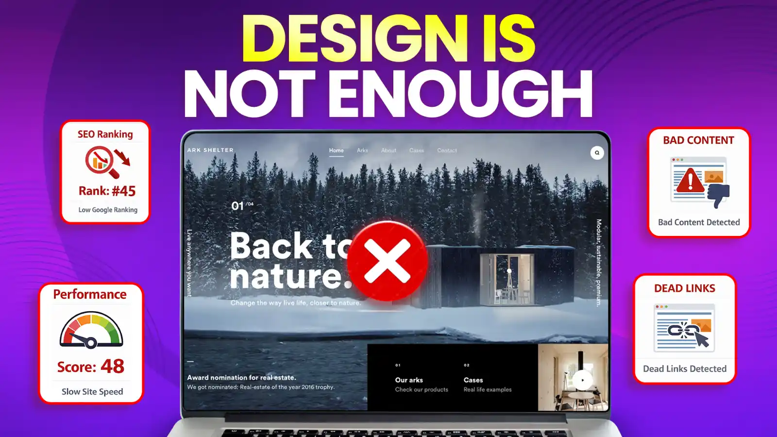
Professional design. This is where looks DO matter — but in service of trust, not vanity. A site that looks outdated, broken, or amateurish signals to visitors that your business might be the same.
Security indicators. SSL certificates, privacy policies, clear terms and conditions. Small details that matter — especially when you're asking people to submit personal information.
Real contact information. A physical address, a phone number, real email addresses. Nothing says "we might be dodgy" quite like a website with no way to reach a human being.
SEO Foundations Are Built Into the Structure
Search engine optimisation is not something you bolt on after your website is built.
It needs to be baked into the foundation from day one.
And this is another area where template builders fall flat on their face.

Technical SEO Starts With How Your Site Is Built
A well-built website has clean, semantic code that search engines can easily crawl and understand. Proper heading hierarchies. Meaningful URL structures. Optimised meta titles and descriptions. Fast load times. Logical site architecture.
When you build on a template platform, you're at the mercy of however that platform generates its code. You can't control the output. You can't optimise the structure.
You're stuck with whatever bloated mess the platform spits out.
And search engines notice.
Content Structure Matters
Your content needs to be structured so both humans and search engines can understand it:
- Proper heading tags (H1, H2, H3) creating a clear content hierarchy
- Descriptive, keyword-rich URLs — not strings of random numbers
- Alt text on every image describing what it actually shows
- Internal linking between related pages
- Schema markup giving search engines additional context
These aren't advanced techniques. They're fundamentals.
But fundamentals that most template-built sites get wrong because the platforms either don't support them properly or make them unnecessarily difficult.
Content That Speaks to Your Customer, Not Your Ego
Too many business websites are written entirely from the business owner's perspective.
"We are the leading provider of..."
"Our team of experienced professionals..."
"We pride ourselves on..."
Nobody cares. Harsh but true.
Your website content needs to be written from the customer's perspective. What problems do they have? What solutions are they looking for? What questions are they asking?
Write for Humans First, Search Engines Second
Yes, you need keywords for SEO. But cramming your pages with awkward, keyword-stuffed sentences is a surefire way to turn off both visitors and Google.
Google is smarter than that now.
Write naturally. Answer real questions. The SEO will follow.
Every page should answer a specific question or solve a specific problem for your target customer. Services pages should explain what you do, who it's for, and what the outcome is. Your about page should build trust. Your blog should provide genuine value.

Analytics and Continuous Improvement
Here's something that separates professional websites from amateur ones.
Measurement.
If you're not tracking what happens on your website, you're flying blind.
You need to know:
- How many people visit your site
- Where they come from
- What pages they look at
- How long they stay
- How many take action
Set Up Proper Tracking From Day One
At a minimum, you need Google Analytics and Google Search Console. You should be tracking form submissions and any other conversion actions. And you should be reviewing this data regularly — not just glancing at it once a year.
The beauty of a well-built website is that it can be continuously improved based on real data.
Test different headlines. Different CTAs. Different layouts. See what actually works.
Identify pages where people drop off and fix them. Double down on what's working. Cut what isn't.
This is not a set-and-forget exercise.
Your website should be a living, breathing tool that evolves with your business and improves over time.
The Bottom Line
Your website is the most important marketing asset your business has.
More important than your social media.
More important than your business cards.
More important than your office fit-out.
It's often the first impression a potential customer has of your business. And in many cases, it's the deciding factor in whether they choose you or your competitor.
A pretty website that's slow, confusing, hard to use on mobile, and doesn't convert is not doing its job.
And if you built it on a template platform because it was cheap and easy, there's a very good chance it's falling short in most of these areas.
At Dab Hand Marketing, we build websites that are fast, conversion-focused, and engineered to generate real business results. Not template sites. Not drag-and-drop page builder sites. Custom-built, high-performance websites designed to be your hardest-working salesperson.
If you're tired of having a website that looks nice but does nothing for your business, book a free strategy call with us.
No pressure. No jargon. Just a straight-up conversation about what's holding your site back and how to fix it.

Book a free 45-minute
audit call with Harry
We'll look at your current site, talk through what needs improving, and see how we can help. If we can't, we'll point you somewhere that can.