5 Signs Your Website Is Costing You Customers
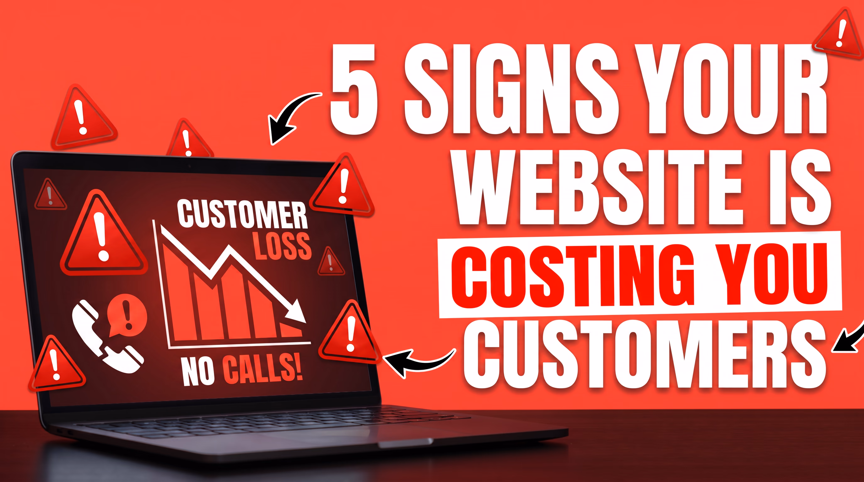
Most business owners assume their website is 'fine'. But fine is often the enemy of great — and in the digital world, a website that's just fine can quietly haemorrhage leads every single day.
We've audited hundreds of websites at Dab Hand Marketing. Here are the five warning signs that come up again and again — and exactly what to do about each one.
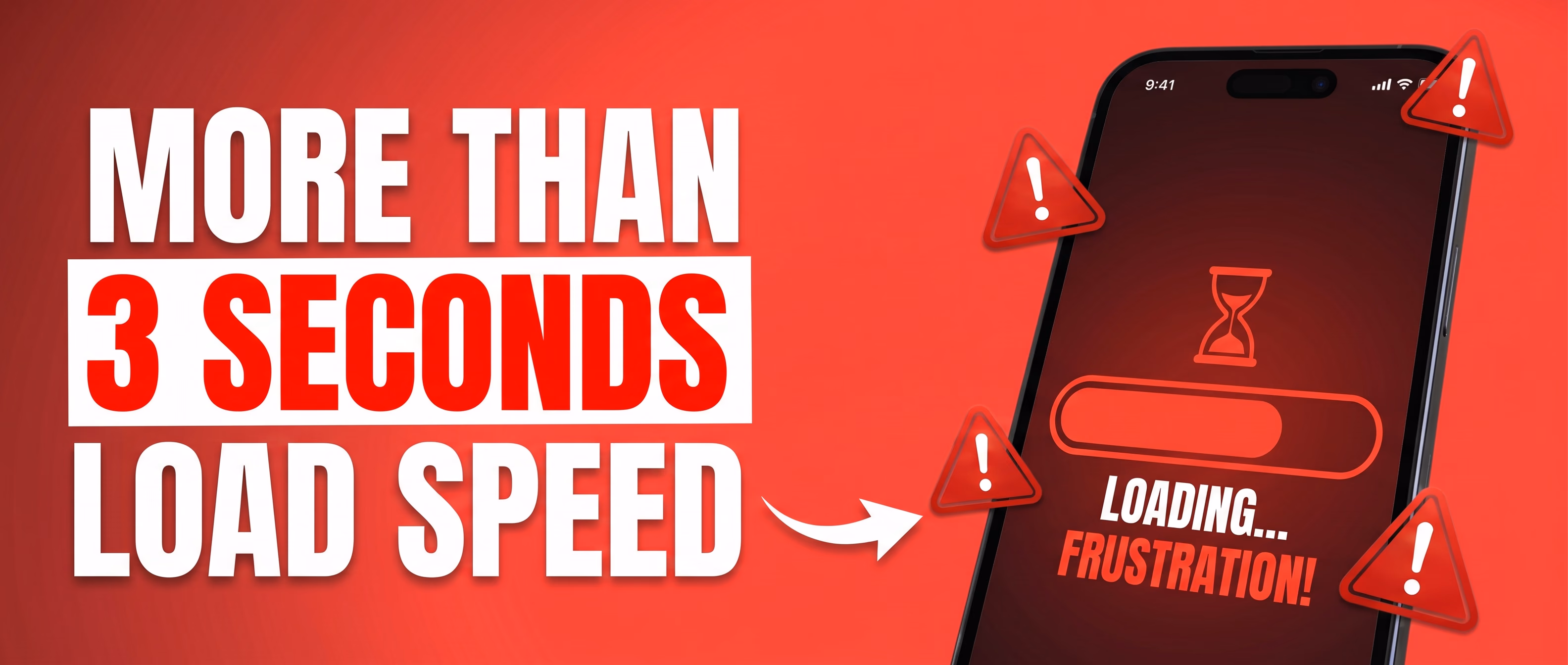
1. It Takes More Than 3 Seconds to Load
Google's research is unambiguous: 53% of mobile users abandon a site that takes longer than 3 seconds to load. Every extra second costs you conversions. If your site is slow, you're not just annoying visitors — you're actively handing them to your competitors.
Run your site through GTmetrix (free at gtmetrix.com). It gives you a full waterfall breakdown of everything that's dragging your load time down — images, scripts, fonts, third-party embeds. You'll see exactly what's causing the problem. Look specifically for:
- Hero videos on the homepage. Nobody watches them. They are a load speed killer. Remove them.
- Unoptimised images. Anything not served in WebP or AVIF format is almost certainly oversized.
- Too many WordPress plugins. Every extra plugin adds HTTP requests. Audit them ruthlessly — if you're not using it, delete it.
- Third-party scripts piling up — live chat, cookie banners, analytics tags, Facebook Pixel. Each one adds load time.
Target sub-2 seconds on mobile. If you're scoring below 70 on Google PageSpeed Insights, it needs fixing immediately. A fast site isn't a nice-to-have — it directly affects your Google rankings too.
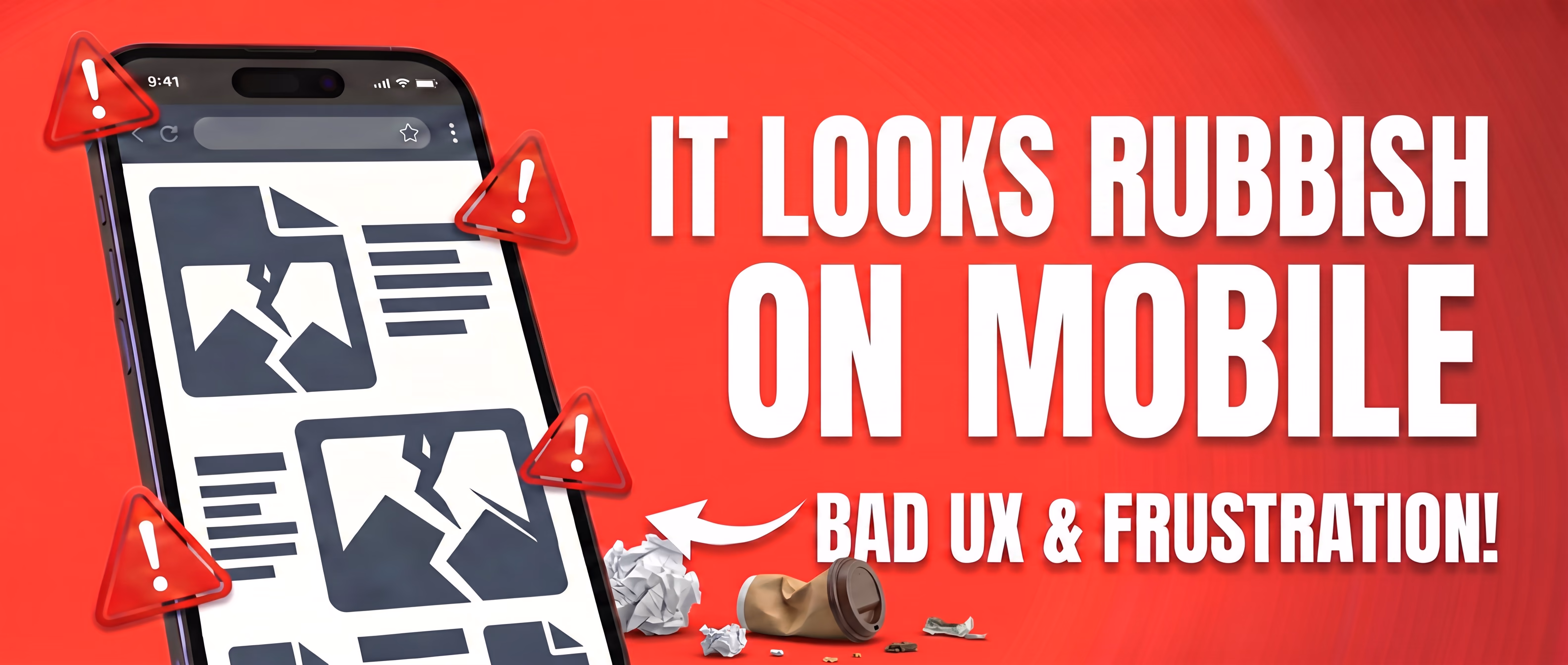
2. It Looks Rubbish on Mobile
More than 60% of all web traffic comes from mobile devices. If your site looks like a shrunken desktop page — tiny text, buttons too close together, images that don't fit — you're losing the majority of your potential customers before they've even read a word.
Here's what most people get wrong: they check mobile by dragging their browser window smaller. That's not the same. Get your actual phone out. Try it on an Android too if you can borrow one. Tap the buttons. Fill in the contact form. Scroll through the page. You'll notice things immediately that you'd never spot on a screen resize — spacing issues, text that's too small to read, forms that don't work properly.
The browser's responsive preview gives you a rough idea, but it's not the full picture. Real testing means real devices.
Mobile-first design isn't a trend. It's a must. If your site isn't built with mobile at its core, you're not just losing marks with Google — you're losing customers every single day.
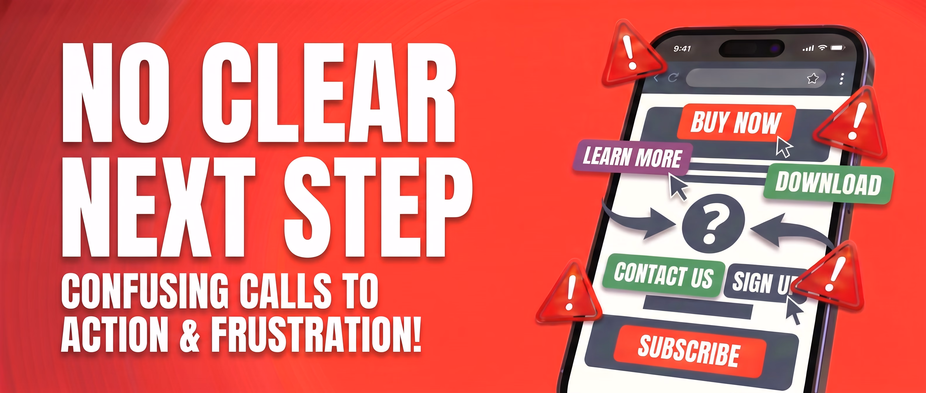
3. There's No Clear Next Step
Visitors arrive on your site. They read a bit. Then… what? If the answer isn't blindingly obvious — a phone number, a 'Book a Call' button, a contact form — they'll leave without doing anything.
Every page should have one clear call to action. Not five options. One. Make it easy for people to give you money.
Here's how to fix it right now:
- Pick ONE primary action per page — book a call, get a quote, download the guide. Choose one.
- Repeat it. Put it in the header, midway down the page, and at the bottom.
- Make it specific. 'Book a Free 20-Minute Website Review' beats 'Contact Us' every time.
- Use a free heat mapping tool like Hotjar to see exactly where visitors are dropping off. The data will surprise you.
If someone can land on your homepage and leave without knowing what you want them to do, your CTA needs work.
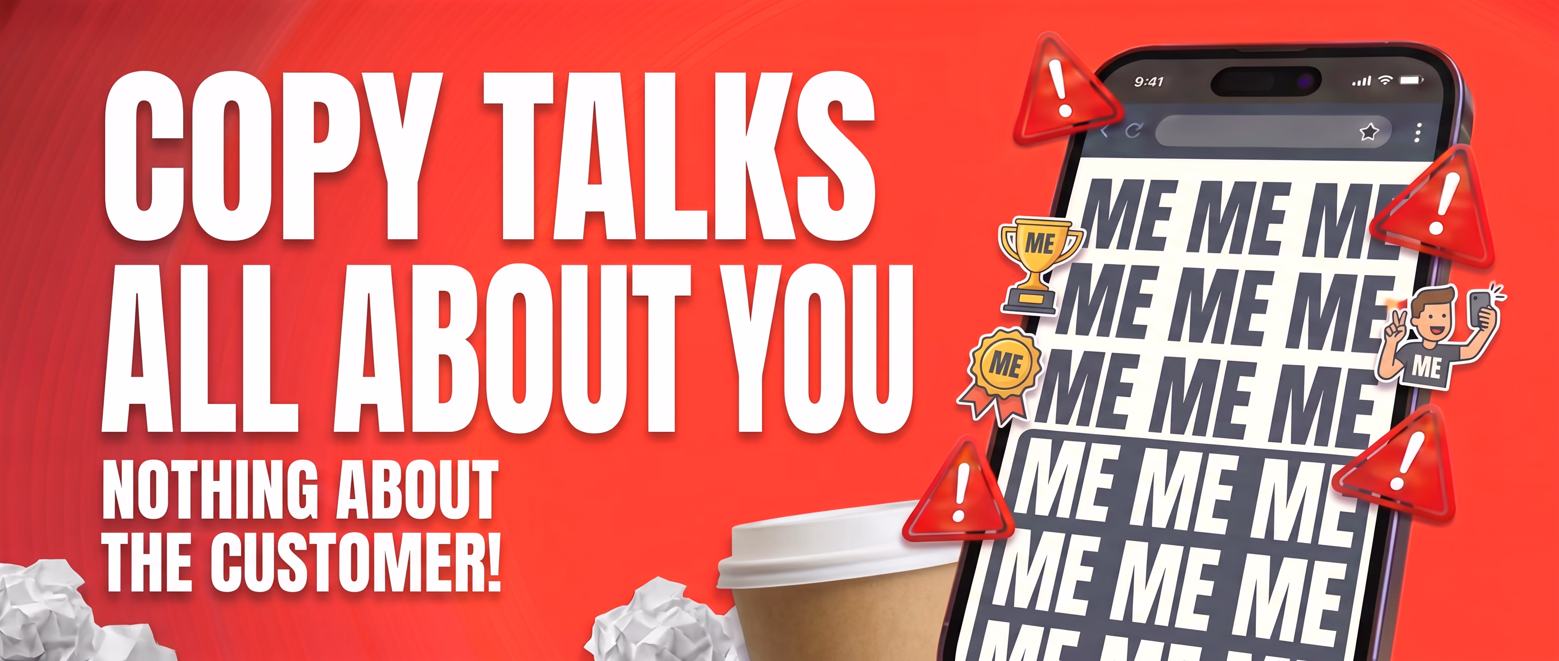
4. Your Copy Talks All About You, Not Your Customer
Go to your homepage right now. Count how many times you use the words 'we', 'our', 'us'. Now count how many times you mention a problem your customer actually has.
Most business websites read like CVs. 'We were founded in 2005. We have 20 years of experience. We are passionate about what we do.' Your visitors don't care. They want to know: can you solve my problem?
Rewrite everything through your customer's eyes:
- Lead with the problem: 'Not getting enough leads from your website?'
- Follow with the solution: 'We build sites that turn visitors into enquiries — and we can prove it.'
- End with proof: a testimonial, a case study, a specific result.
- Replace 'we provide' with 'you get'. Every time. Without exception.
You don't need a copywriter to fix this. You just need to stop talking about yourself and start talking to your customer.
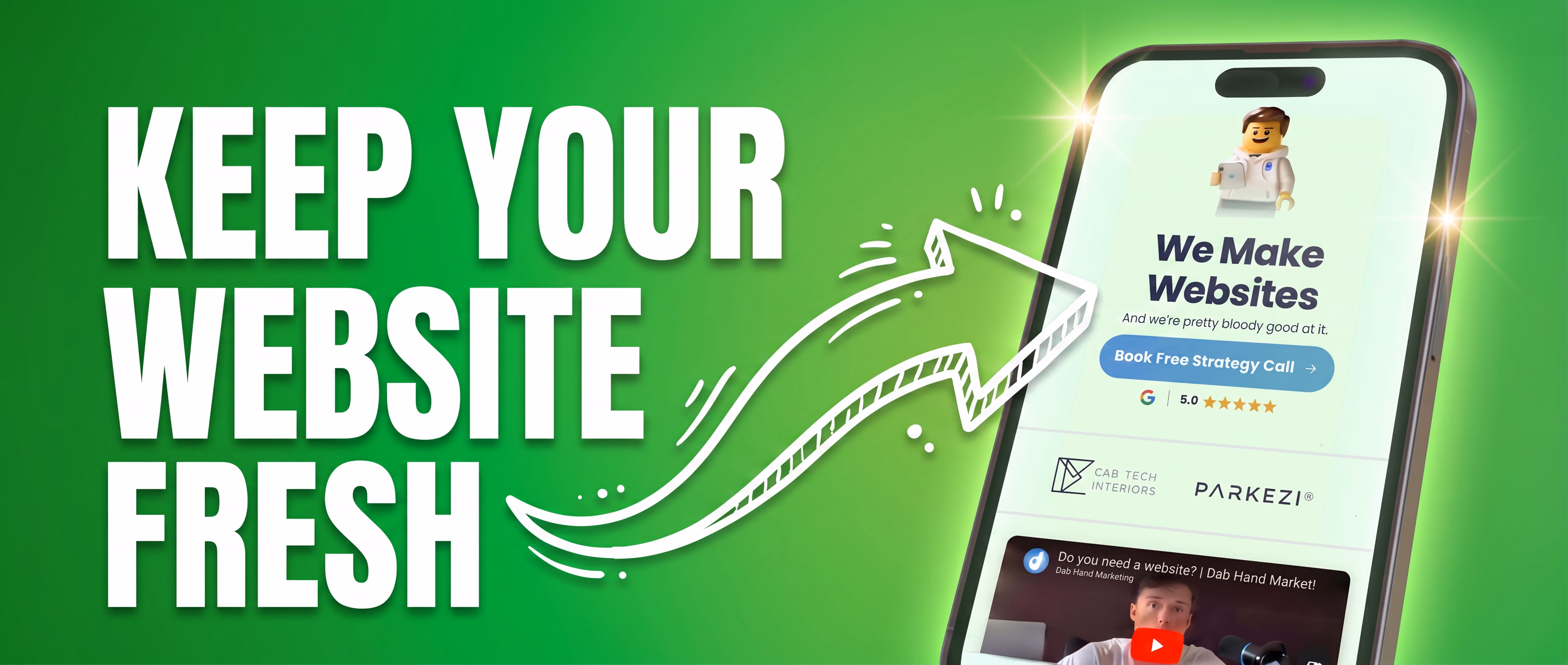
5. Your Website Is Your Shop Window. Keep It Fresh.
If you walked past a shop with peeling paint, a faded sign, and a window display that hadn't changed since 2019 — would you go in? Your website is exactly the same. First impressions happen in under a second, and a stale website tells people either you're too busy to care, or not busy enough to bother.
Run through this quick checklist right now:
- Is your most recent project or case study on there?
- Are your Google reviews up to date and featured prominently?
- Does the copyright year in your footer still say 2022 or 2023?
- Are there team members listed who left two years ago?
- Is your pricing or service list still accurate?
Updating your website regularly also signals to Google that your site is active.
Fresh content = better rankings. It doesn't need to be a full redesign — a new case study, a blog post, an updated testimonial. Little and often is enough.
Not sure where your website stands?
We offer a free website audit that covers all five of these areas — load speed, mobile experience, calls to action, copy, and freshness. You'll get a clear picture of what's costing you customers and exactly what to fix.
Get in touch to book yours.

Book a free 45-minute
audit call with Harry
We'll look at your current site, talk through what needs improving, and see how we can help. If we can't, we'll point you somewhere that can.